Surface Pro
A Microsoft Product

Overview
Microsoft is a leading technology company developing diverse products for various audiences.
It operates three business segments:
- Productivity Processes
- Business Processes
- Personal Computing and Intelligent Cloud.
It is best known for its operating system “windows” and “office 365”.
Microsoft's mission is to drive growth, empowerment, and achievement for every person/organization.
The Concept
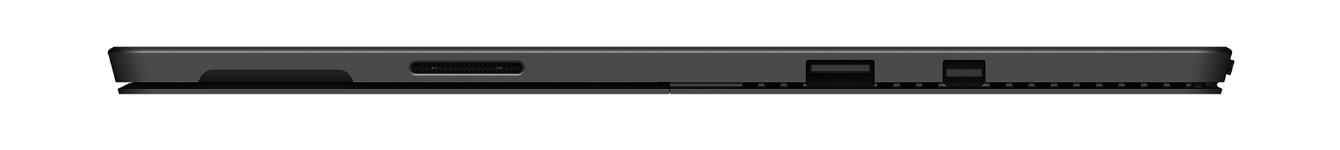
Surface Pro 7 is a Microsoft product featuring a “2 in 1” concept.
It is both a laptop and an iPad. An Ultra-light and versatile computer allowing you to comfortably work anywhere you want.
The goal
My goal was to create a website specifically designed for the Surface Pro
laptop showcasing its capabilities with a simplified minimalistic approach while maintaining the brand language.
The Challenge
Branding
One of Microsoft's pain points is the lack of brand connection in its product design.
The minimalistic website UI mimics different brands and doesn't associate the Surface Pro with Microsoft.
Marketing
One of the most important things that the surface lacks is the domain marketing approach.
Surface.com redirects the users to a sub-link of Microsoft website thus removing the feeling of a website
with a specific domain designed uniquely for the Surface.
User Research
As part of my research, I created a questionnaire asking users for the first three words that came to mind when hearing "Microsoft" and "Apple."
My goal was to understand brand perception, specifically if they associated the brands with technology or products.
For Microsoft, most users said "technology," "Windows," and "Bill Gates."
For Apple, responses included "iPad," "iPhone," "Mac," and "beautiful design."
This shows that while Microsoft is seen as a strong technology company, it lacks the branding and marketing that Apple excels at,
particularly in associating products with the brand.
My Solution
Maintaining brand design language is crucial for users to associate a product with the company.
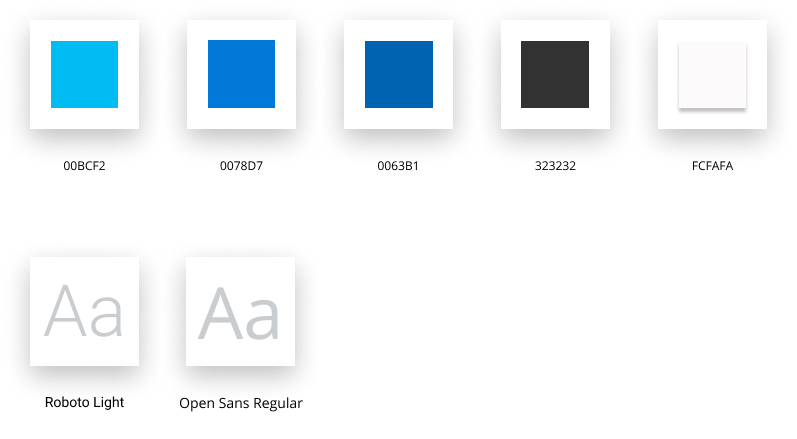
I used Microsoft's logo squares and blue colors to create a unique design for the Surface,
ensuring users recognize it as a Microsoft product.
A dedicated website for the Surface can help users easily find information.
Simplifying details and design helps users understand the Surface Pro's benefits.
Homepage design

Colors And Typefaces
Iconography
I used simple and clean black contoured icons to compliment
the product's simplicity and elegance.

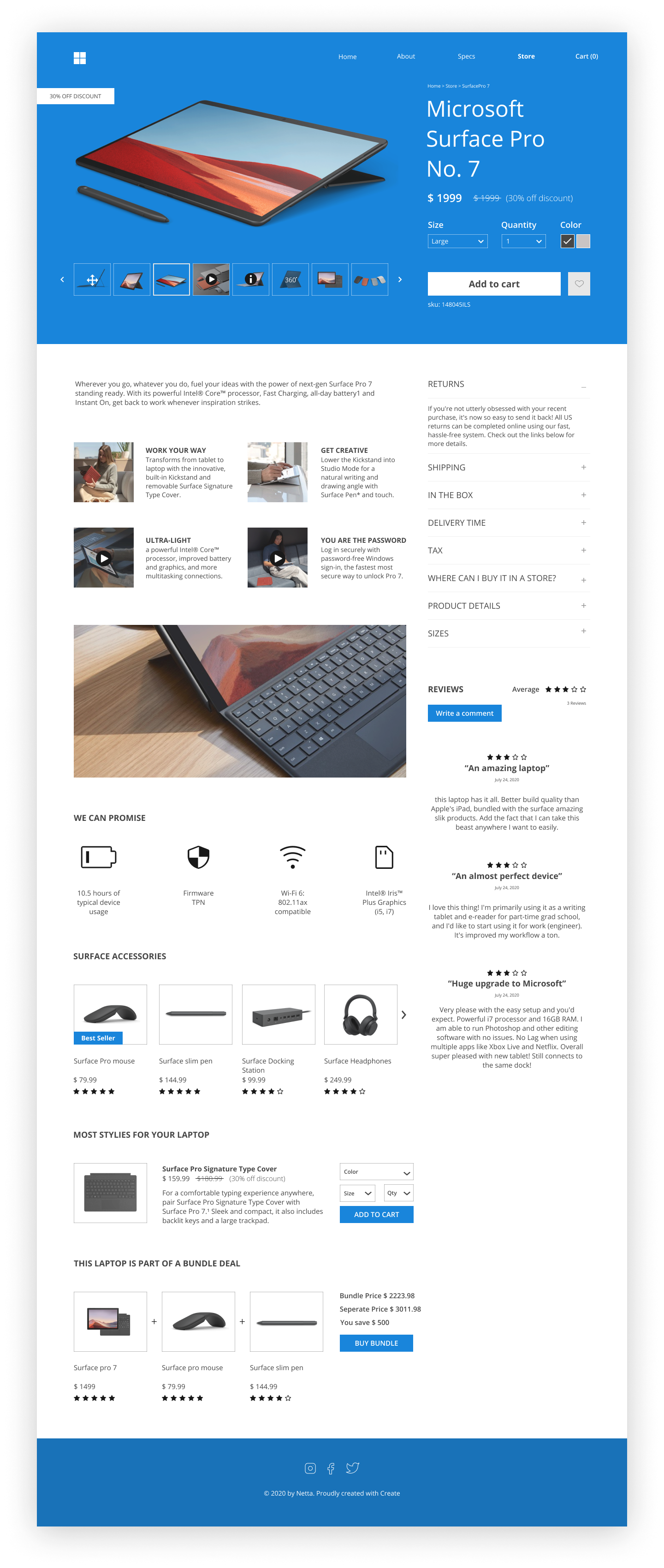
Product Page
Mobile Version